My website over time
After about 6 1/2 years, the time has come again. A new website. It's not the first and hopefully won't be the last. And it is a good opportunity to look back on the last decades. From the simple beginnings to the modern sites that are common today. Fortunately, I have backups that go way back. Well, you know, a nerd...
It all started in the mid-90s. The internet was still very young and innocent. James Gosling had just invented the Java programming language and we were surfing through the still quite manageable internet with Netscape Navigator. The web pages were very simple. The reason for this was that at that time HTML could do very little and with our 56k modems it took ages for the data to arrive. It was also very expensive fun. You still paid for the internet per minute. No, not everything was better in the past. And - hard to imagine - there was no Google yet.
At that time, I had just bought my first domain. Syndik.at and my first address was das.syndik.at. I must have thought it was funny at the time. By chance, I was also just learning Java at that time. Browsers could display so-called Java applets and so I had the idea to write the website completely in Java. Just to put my knowledge into practice somehow. It didn't really make sense. And like many other technologies from that time, Java applets have long since disappeared from the scene. But it still works with an ancient Firefox.
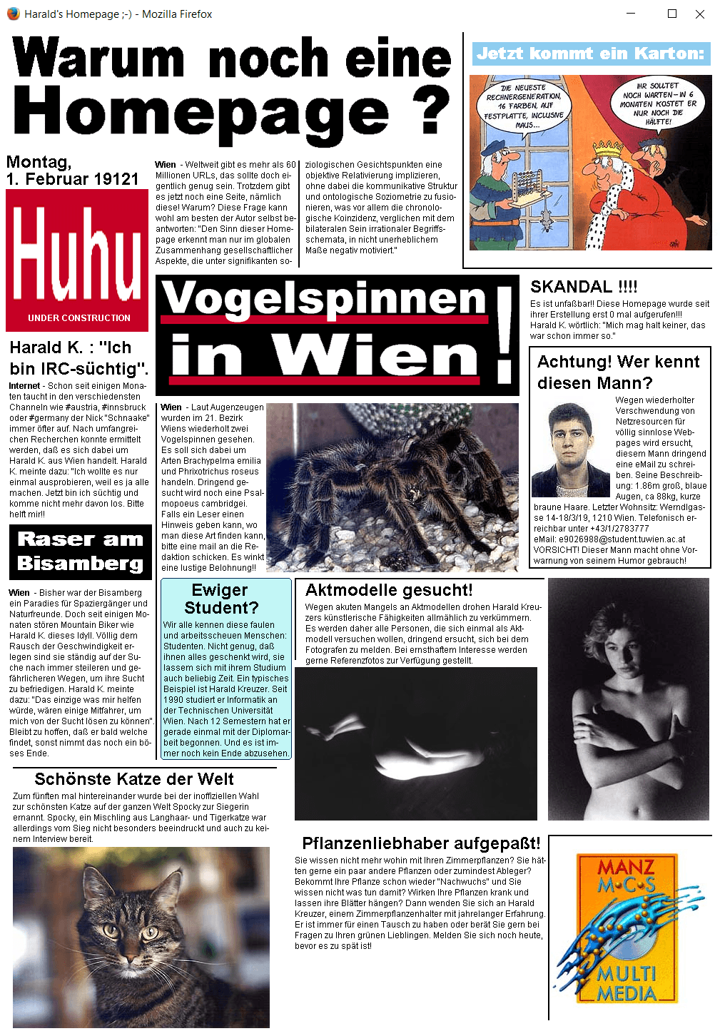
What can I say. I was young :) The design is "very slightly" based on a well-known German daily newspaper and the content is probably not much better. But the Y2K bug is interesting.
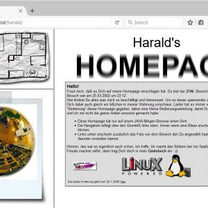
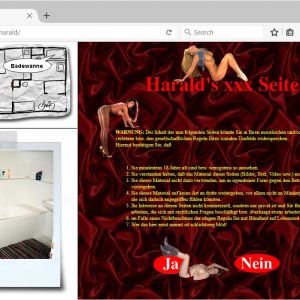
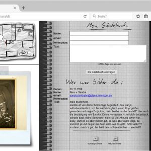
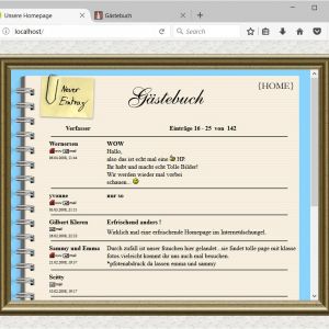
In 1997 it happened again. In the meantime I lived in a nice little apartment in the 3rd district. It was the time of GeoCities websites. Animated GIFs were the absolute hit. The more, the better. Layouts were still done with frames and tables. The Under Construction banner was not missing and of course a guestbook! Facebook didn't exist yet, but we spent a lot of time in IRC.
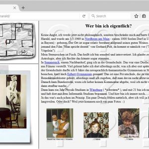
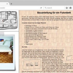
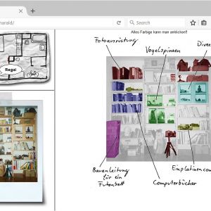
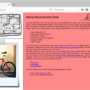
Somehow I got the idea to turn my apartment into a homepage. This time it was a real website, which still needed some Java, but was mostly real HTML. Originally the pages were written in ASP for a Microsoft Internet Information Server, because we had that in the company and I was allowed to use it. Later I switched to Linux which was quite easy thanks to the Apache::ASP module by Josh Chamas. On his site I am even mentioned in the credits. Those are nice memories.
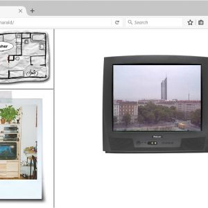
The screen was divided into three areas, the apartment map, a photo of each area, and the actual content. Depending on where you clicked on the apartment plan, the other areas changed accordingly. Unfortunately I can only show a few screenshots now, but it was really fun to click through the apartment. There was even a webcam with a view out of a window. The xxx site was of course just a fake, but I got quite a few emails from people who wanted to have access. I thought it was funny... There was also a "hidden" diary that had some loyal readers. That was reason enough to buy the domain meintagebuch.net. The idea was that everyone could write their daily thoughts and experiences there, share them and network with other people. Do the ideas sound familiar to you? However, I didn't really pursue it then. Later, the whole world was blogging and networking. If you wait too long, life punishes you. Unfortunately true.
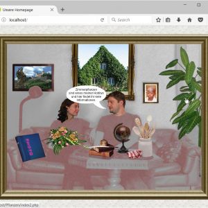
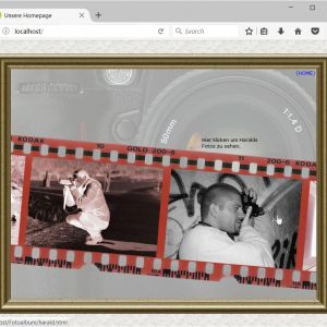
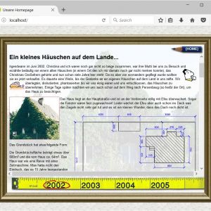
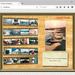
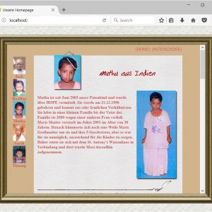
The years passed. In the meantime we wrote the year 2003. It was time for something new and the apartment was also no longer current. This time I made a joint website with my girlfriend at that time. The basic idea was similar as before, only this time it was about the people. Also this time you could click through the different topics. Technically it was still a frame solution, only this time much more complex and it took me a whole evening to get the site working again now. Especially because PHP has changed quite a bit over the years.
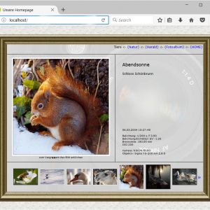
The main focus of the site was the photos, as photography has become a more and more intense hobby. But uploading the photos was quite cumbersome, for example the image information had to be stored as HTML code in the EXIF data, so that it could be displayed automatically. Likewise, a small and a large preview had to be created for each photo. All a bit tedious.
Since the interest in the website was rather one-sided and it was basically only about the photos, I was no longer happy with the website. Something new was needed again. And this time it was only about the photography. The time of private self-promotion was over.
In 2008 I started to look for ideas. Of course, I looked around a bit to see what other photo sites looked like. Nothing really appealed to me. I wanted something completely different. But what? While thinking about it, the image of an old box full of photos came to my mind, where you rummage around and look at the photos. You can see the result in the little video. Uploading new photos was also very cumbersome on this website. Not every browser was ready to rotate images via CSS. So I had to manually create the rotated thumbnails for each photo. However, a Photoshop action made my life a little easier.
Two years later I revised the layout a bit, but the concept remained the same. This time, the photos were grouped by year for a more focused look.
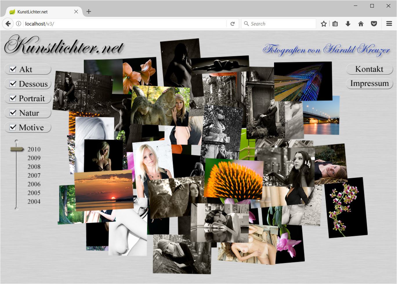
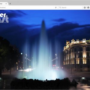
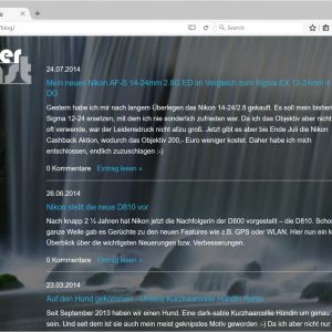
Actually, I was very satisfied with this website. But the world is changing. Especially in technology. No one could have guessed what changes the introduction of the iPhone in 2007 would bring about. The motto "mobile first" was now in effect, meaning that a website had to be developed primarily for the smartphone, since more and more people were primarily using their cell phones to surf the web. In my opinion, this was the death of creative web design. I also adapted and rebuilt my website back in 2011. The design was very simple. The photos were displayed full screen and at the bottom there was a bar with the thumbnails. Finished. But something fundamental had changed in the technology. It was the first website that was created with a content management system. After a long research I decided to use concrete5, which I still use today. And there was a small blog for the first time.
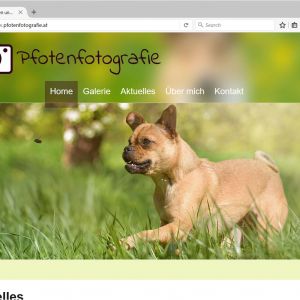
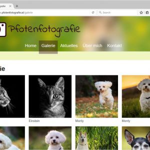
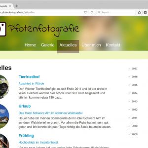
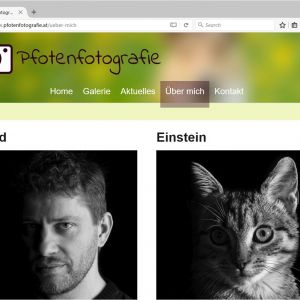
Then something quite unexpected happened. It was 2013 and suddenly there was a dog in the household. All of a sudden my motives changed. First it was my own dog, then the dogs from the circle of friends and finally it became so intense that I even registered a business. Pfotenfotografie was born. Since then I can officially call myself a photographer. The layout of the website was bought this time, because I just didn't have the time and desire to play around with HTML and CSS anymore. Besides the blog, there were only animal photos on the website, because I didn't photograph anything else anyway. And for the first time, I was able to finance my equipment solely with the income from photography. That was a good feeling.
In the meantime, a few years have passed again. Ronja has not lived with me for a while and with her also the interest for animal photography has gone. Now two sweet tomcats keep me company, Einstein and Newton. More or less over night I decided to end the paw photography and to replace it with a new website. And this is it now. The old photos are back online, but otherwise the content is identical. I still enjoy photographing, but it is not as intensive as it used to be. Instead, I want to write more on the blog, especially about my electronics and 3D printing tinkering. We'll see what the future brings.
